
Most products don’t fail because they look bad. They fail because people can’t work out how to use them. Or they can, but it feels like a fight.
That’s the gap the principles of good design exist to close. They give you a way to judge a product before a single user complains. Not by taste. By purpose.
Here’s the uncomfortable part: bad design is invisible to the people who made it. They know how it works, so they can’t see what’s confusing.
Whether you’re sketching your first app screen or leading a team that ships to millions, product design principles stop you from guessing. They give you a shared language, and a way to defend a decision in a room full of opinions.
This article covers who set the standard, what the principles of good design look like in real products, and how to apply them without turning your process into a box-ticking exercise. Expect examples from Braun, Apple, Google and apps you opened today, like Swiggy and PhonePe.
Good design isn’t decoration. It’s a long run of small, deliberate choices that make someone’s life easier. So what does “good” actually mean?
Table of Contents
What Is Good Design and Why Does It Matter?
Good design solves a real problem clearly, simply and fairly for the people using it. It balances how a product looks, how it works and how easy it is to use. When one of those slips, people feel it, even if they can’t say why.
Understanding the Meaning of Good Design
Picture a door with a handle on the side you’re meant to push. People pull, stop, then push. Nothing is broken. The door still fails. Don Norman uses examples like this in The Design of Everyday Things, and designers now call them “Norman doors”.
Appearance, function and usability are three separate things. A product can look great and work badly. Or work perfectly and confuse everyone. That’s why modern user experience design treats looks as one layer of the job, not the whole job.
Design also shapes decisions quietly. A default setting, a button’s colour, the order of options: users rarely notice them, but they follow them. Design aesthetics matter because they build first impressions. But they’re the front door, not the whole house.
A beautiful product isn’t automatically a well-designed one. Beauty gets attention. Design gets people through the task.
Also Read: 5 Rules Of Clean Design: How to Create Simple, Professional, and Effective Visuals
Why Good Design Matters in Product Development
Good design pays off in ways you feel before you can measure them:
- Products become easier to understand.
- Customers are more satisfied.
- Unnecessary complexity disappears.
- Trust builds faster.
- The experience stays consistent across screens.
- Long-term value holds up as the product grows.
None of this shows up on a feature list. All of it shows up in reviews, retention and support tickets.
Also Read: Product Development Strategy: A Practical Guide to Building Products That Succeed
The Difference Between Good Design and Bad Design
Compare two online checkouts. One forces you to create an account, type your address twice and hides the delivery fee until the last screen. The other lets you pay with UPI in two taps and shows the full bill upfront. Same product. Very different feeling.
The stakes are real. The Baymard Institute puts average cart abandonment at about 70%. In its 2024 survey, 22% of shoppers said a long or complicated checkout made them leave. Good design usability is what separates the two checkouts above.
| Good design | Poor design |
| Easy to understand | Confusing instructions |
| Purposeful features | Unnecessary features |
| Consistent experience | Inconsistent layouts |
| Accessible interactions | Difficult interactions |
| Clear feedback | Unclear system responses |
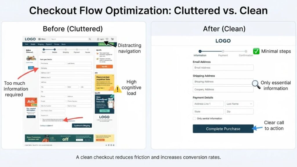
Good design solves a real problem clearly, simply and fairly. It balances appearance, function and usability, which is why a beautiful product that confuses people is not a well-designed product.
Who Was Dieter Rams and How Did He Influence Modern Design?
Dieter Rams is a German industrial designer who led design at Braun from 1961 to 1995. His ten principles of good design, built on the idea of “Less, but better”, still shape how designers judge products today.
A Brief Introduction to Dieter Rams
Rams was born in Wiesbaden, Germany, in 1932. He joined Braun in 1955 and became its head of design in 1961. His work stayed close to one belief: a product should do its job and then get out of the way. That’s minimalist design with a purpose, not a style.
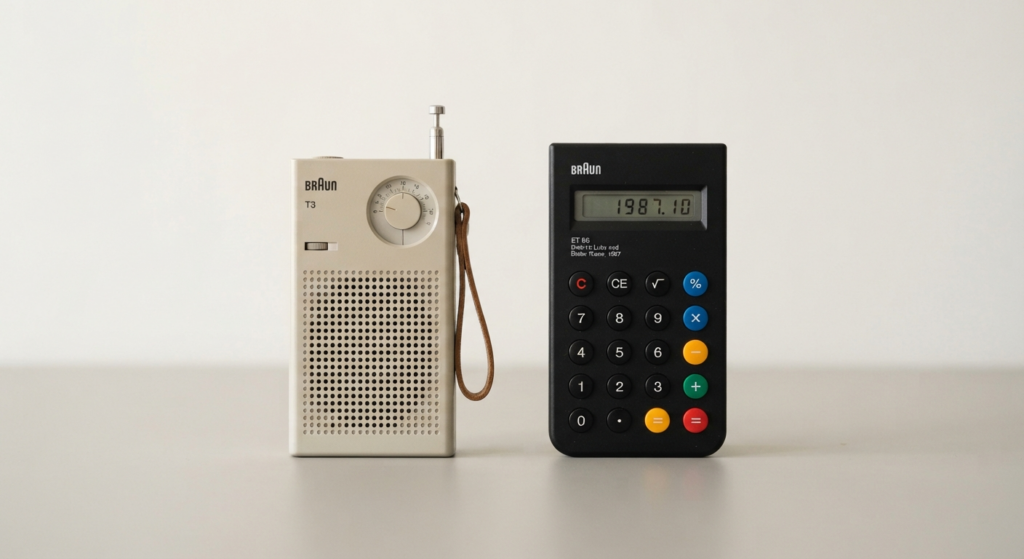
Look at the Braun T3 pocket radio from 1958. A plain grid of speaker holes. One clear dial. No decoration. Designers often point to it as an ancestor of the iPod’s look.
Or take the Braun ET 66 calculator, designed by Dietrich Lubs in Rams’ department. Buttons were grouped by function and coloured by role, so your eye knew a number from an operator before your finger moved. Many people see its echo in the iPhone’s calculator.
Why Did Dieter Rams Introduce His Ten Principles?
In the late 1970s, Rams looked around and saw products crowded with needless forms, features and noise. So he asked himself a blunt question: is my design actually good design? His answer became a short list. Useful. Understandable. Honest. Unobtrusive. As little design as possible.
The list let designers test usefulness and simplicity without arguing about taste. The Dieter Rams 10 principles spread through design schools and studios, and later designers, including those at Apple, have openly drawn on his thinking. Good design principles travel well because they’re questions, not styles. You can ask them of a radio or a checkout page.
The 10 Principles of Good Design Every Product Designer Should Understand
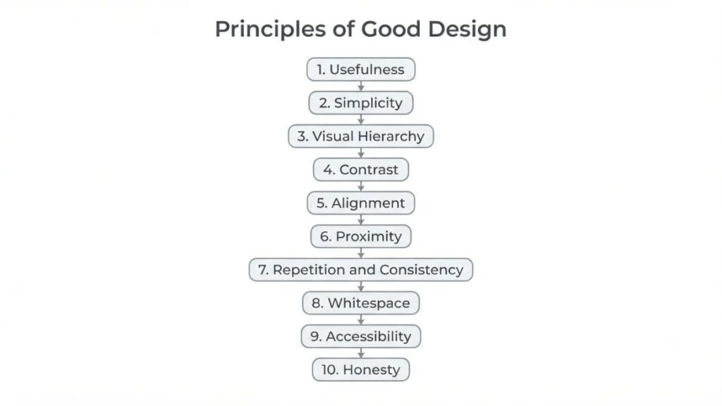
These ten principles of good design blend Rams’ thinking with the visual rules designers use daily. Each has a meaning, a reason, an example and one thing you can do today.
1. Usefulness
Usefulness means a product does a real job for a real person. A beautiful tool that solves nothing is just clutter. The core UPI flow on apps like PhonePe and Google Pay shows it well: scan or pick a contact, enter an amount, confirm. Each step serves one job.
To apply it, write the product’s one job in a sentence before you open any design tool.
Takeaway: if you can’t state the job in one line, you aren’t ready to design it.
2. Simplicity
Simplicity means removing everything that doesn’t help the user finish the task. It’s Rams’ “as little design as possible”. Every extra element is one more thing to read, weigh and misread, which is how simplicity improves product design. Braun’s ET 66 had no spare buttons and no decoration.
To apply it, remove an element and see whether anyone misses it. If nobody does, leave it out.
Takeaway: every element has to earn its place.
3. Visual Hierarchy
Visual hierarchy is the order in which the eye reads a screen, set by size, colour, weight and position. People scan before they read. On most food delivery apps, Swiggy and Zomato included, the pay button is the loudest thing on the cart screen. Nothing competes with it.
To apply it, squint at your design until the details blur. Whatever still stands out is your real hierarchy.
Takeaway: one screen, one primary action.
4. Contrast
Contrast is the visible difference between elements in colour, size or weight. It tells people what matters and keeps text readable. Picture a “Pay now” button in pale grey on white. It’s there. Nobody sees it. WCAG 2.2, the W3C’s accessibility standard, asks for at least 4.5:1 between normal text and its background at level AA, and 3:1 for large text.
To apply it, run every text and background pair through a contrast checker before handoff.
Takeaway: light grey text looks elegant in Figma and unreadable on a bus in daylight.
5. Alignment
Alignment places elements along shared edges or axes, so the eye finds order without effort. Misaligned items feel sloppy, even when users can’t say why. Google’s Material Design builds layouts on an 8dp grid, which keeps edges and spacing predictable.
To apply it, choose a grid at the start and snap every element to it.
Takeaway: if two things almost line up, make them line up.
6. Proximity
Proximity means related things sit close together and unrelated things sit apart. People read grouping as meaning before they read a single word. A good bill summary on Zomato or Swiggy keeps item total, taxes and delivery fee in one block, with payment options set apart.
To apply it, make the gap between groups clearly bigger than the gap inside a group.
Takeaway: space works like punctuation. Use it to show what belongs together.
7. Repetition and Consistency
Repetition means reusing the same colours, type, buttons and patterns. Consistency means they behave the same way every time. People learn your product once, then apply that knowledge everywhere. Material Design is built on this idea: shared components that behave the same from one app to the next.
To apply it, build a component library and reuse it before you invent anything new.
Takeaway: every new pattern costs users learning time. Spend it only when it pays off.
8. Whitespace
Whitespace is the empty space around and between elements. It isn’t wasted. It gives content room to breathe. Google’s search homepage is the classic case: a logo, a search box and a lot of nothing. Apple’s product pages lean on generous space too.
To apply it, increase the padding around key elements first, then ask whether you still need everything on the screen.
Takeaway: when a screen feels crowded, don’t shrink everything. Take something out.
9. Accessibility
Accessibility means people with different abilities can use your product. It’s inclusive design at its simplest. The World Health Organization estimated in 2023 that 1.3 billion people, about 16% of the global population, live with a significant disability. That’s an audience no team can afford to shut out.
To apply it, test with a keyboard only, then with a screen reader on. Treat WCAG 2.2 level AA as the floor.
Takeaway: accessibility is a design input, not a final-week patch.
10. Honesty
Honesty means a product doesn’t trick, pressure or oversell. It’s one of Rams’ original principles, and trust is expensive to rebuild. India’s Central Consumer Protection Authority issued guidelines on dark patterns in 2023, listing 13 deceptive practices including drip pricing and confirm shaming. Dark patterns are interface tricks that push people into choices they didn’t mean to make. Drip pricing adds charges late in checkout.
To apply it, show the final price early.
Takeaway: never make users hunt for the real cost.
The principles of good design combine Dieter Rams’ thinking with the visual rules designers use every day: usefulness, simplicity, visual hierarchy, contrast, alignment, proximity, repetition and consistency, whitespace, accessibility and honesty. Each one is a question a designer can ask of any product.
How to Apply These Design Principles in Real Product Development?
To apply the principles of good design in product development, follow five steps: understand the problem, define the purpose, create an initial design, test with real users, then refine. The order matters. Each step stops you from building on a wrong assumption.
It follows the same logic as the design thinking process: empathise, define, ideate, prototype, test. We’ll use a food delivery app’s checkout as the running example.
Step 1: Understand the Problem Before Designing
Talk to the people who’ll use the product. Watch them do the task. For the checkout, start with the drop-off point: where do people quit, and why?
Also Read: How to Run Product Discovery: A Step-by-Step Process
Step 2: Define the Purpose of Your Product
Write one sentence covering who it’s for, what job it does and what success looks like. For example: “Help a hungry user pay in under a minute, with no surprises.” That sentence becomes your filter for every feature request.
Step 3: Create an Initial Design
Sketch first. Apply hierarchy, proximity and alignment before you touch colour. In the checkout, group the bill, make “Place order” the clear primary action and show the delivery fee early.
Step 4: Test Your Design With Real Users
Put a prototype in front of real people. Jakob Nielsen’s 2000 research at Nielsen Norman Group found that five users uncover about 85% of usability problems in one round. Watch where they hesitate. Don’t explain.
Step 5: Refine and Improve the Product
Fix the biggest problem first, then test again. Maybe testers misread the total. Adjust, re-test, repeat. Good products aren’t finished. They’re maintained.
Also Read: A/B Testing in Product Management: A Practical Guide
Real-World Examples of Good Design
Apple, Braun and Google’s Material Design each show the principles of good design from a different angle: simplicity, function and consistency. None is perfect, but each makes its thinking visible.
Apple: Simplicity and Functionality
Apple’s product pages show one product, one message and a lot of space. Its interaction patterns, like swipe, pinch and tap, stay familiar across devices, and its Human Interface Guidelines spell them out for developers. Details matter too: haptics, animation timing, the way a case clicks shut.
Jony Ive, Apple’s long-time design chief, has spoken openly about admiring Rams’ work. To be fair, no Apple product follows all ten principles perfectly, and Apple’s own software has drawn design criticism over the years.
Braun: The Importance of Functional Design
Braun showed that functional design can age well. Controls were clear: a dial looked like a dial, a switch like a switch. Buttons were grouped by purpose. Surfaces stayed calm. Some Braun products from the 1950s and 60s still look current, and museums such as MoMA hold them.
Google’s Material Design: Consistency Across Digital Products
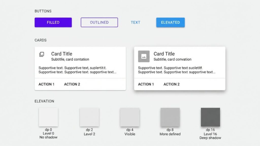
Google launched Material Design in 2014. It gave designers reusable components, a visual hierarchy built on elevation and shadow, and familiar patterns for common tasks. Touch a button and a ripple confirms it. That’s clear feedback. The result is design consistency across thousands of apps, so users don’t relearn the basics every time.
Modern Product Design: What Is Changing in 2026?
Four shifts are changing how the principles of good design get applied in 2026: AI-assisted workflows, accessibility rules with legal weight, sustainability requirements, and personalisation that doesn’t overcomplicate the product.
AI Is Changing the Way Designers Work
AI tools now generate layouts, variations and copy in seconds. That’s useful for first drafts. It’s less useful for judgement. A tool can’t tell you whether your checkout is honest or your hierarchy is clear. Those calls still need a person and real users.
Accessibility Is Becoming a Core Design Consideration
The W3C published WCAG 2.2 in October 2023. It adds criteria such as a minimum 24 by 24 pixel target size for interactive elements. The European Accessibility Act began applying in June 2025, which pushed many digital products to take this seriously. Even so, WebAIM’s 2025 Million report found detectable WCAG failures on 94.8% of home pages, with low contrast text the most common.
Sustainable Design Is More Important Than Ever
Sustainable product design now has regulation behind it. The EU’s Ecodesign for Sustainable Products Regulation came into force in July 2024 and pushes products to last longer and be easier to repair. For digital products, think lighter pages and fewer unneeded features. Rams called this principle “environmentally friendly”. He was early.
Personalisation Without Unnecessary Complexity
Personalisation helps when it removes effort. Spotify puts playlists made for you on the home screen, and you configure nothing. It hurts when it asks too many questions or reshuffles the layout. Personalise content before structure.
Also Read: 12 Best AI UI/UX Design Tools: Features, Use Cases & Comparison
Common Design Mistakes Product Designers Should Avoid
Most design mistakes come from ignoring the principles of good design and designing for yourself instead of for users. Here are six to watch for.
Designing for Personal Preferences Instead of Users
You’re not your user. Your taste isn’t evidence. User-centred design means validating choices with real people, even when you feel certain.
Making Products Look Good but Work Poorly
A polished Dribbble shot isn’t a product. If people can’t finish the task, the visuals haven’t done their job.
Adding Too Many Features
Every feature adds weight. Menus grow, screens crowd and the main job gets buried.
Ignoring Accessibility
Low contrast, tiny tap targets and unlabelled buttons shut people out. Each one is a customer you’ve quietly lost.
Skipping User Testing
Assumptions feel like facts until someone gets lost in your flow. A few test sessions cost far less than a redesign.
Following Trends Without Understanding Their Purpose
Glassmorphism, neumorphism, whatever comes next. A trend earns its place only if it helps users. If it hurts contrast or clarity, skip it.
Also Read: Is a UX Design Career in 2026 Worth It? Salary, Jobs & AI
Practical Checklist for Creating Better Products
Save this one. A product built on the principles of good design usually answers yes to every question below.
- Does the product solve a real problem?
- Is its main purpose clear?
- Can users understand how it works?
- Are all features genuinely useful?
- Is the visual presentation consistent?
- Is the product accessible to different users?
- Does it provide clear feedback?
- Have real users tested it?
- Are unnecessary elements removed?
- Have durability and environmental impact been considered?
Conclusion: Good Design Starts With Understanding People
Good design isn’t about making something look impressive. It’s about making something easier to use, easier to trust and kinder to the person on the other side of the screen. The principles of good design all point the same way: usefulness, simplicity, accessibility and honest decisions do most of the work.
Sometimes, the best design is the one users don’t have to think about. It simply works.
So don’t try to master all ten principles at once. Pick two for your next project. Maybe hierarchy and proximity. Apply them, test them, then add more.
If you want to connect design decisions to strategy, roadmaps and real user problems, YUP’s Product Management course is built for that. It shows you how to turn research into product choices, which is where good design starts.
FAQ: Frequently Asked Questions About Good Design
1. What are the 10 principles of good design?
Dieter Rams’ ten principles describe good design as innovative, useful, aesthetic, easy to understand and unobtrusive. It should be honest, long-lasting, environmentally friendly and carefully considered down to the smallest detail. Above all, good design focuses on what matters and avoids anything unnecessary.
Who introduced the ten principles of good design?
Dieter Rams, a German industrial designer who led design at Braun from 1961 to 1995. He wrote the list in the late 1970s after asking whether his own work was good design. It gave designers a testable set of questions.
Why are design principles important?
They help designers make purposeful, consistent and user-friendly decisions. Principles replace “I like it” with “does it serve the user?” They also settle team debates faster.
What makes a product design successful?
A successful product is useful, works as expected, is easy to use and can be used by many kinds of people. It also leaves users satisfied. If it looks great but fails any of those tests, it’s only half done.
What is the difference between good design and aesthetic design?
Aesthetic design is about how a product looks. Good design includes looks, but also usefulness, clarity, accessibility and honesty. Visual appeal is one part of a successful design, not the whole of it.
How can beginners learn good product design?
Study products you use daily and ask why they work. Practise sketching, research real users and test prototypes early. Try redesigning one screen of an app you know, then test it with five people.
How does accessibility improve product design?
Accessible experiences help more people use a product independently. They also tend to improve things for everyone: clear contrast and large tap targets work in bright sunlight, too.
Are Dieter Rams’ principles still relevant today?
Yes. The principles of good design he set out apply to apps as much as radios. His “environmentally friendly” principle now looks ahead of its time, and AI-heavy products need his focus on clarity more than ever.