

Picking a visual analytics platform sounds straightforward at first… until teams actually start using one. That’s where things get interesting. This blog leans into those real-world moments; what works smoothly, what slows people down, and where expectations don’t quite match reality. It touches on the usual suspects like pricing, usability, and AI features, but not in a checklist kind of way. More from the angle of how they show up day to day. There’s also a look at how different teams, technical or not, end up using these tools differently. Nothing overly polished here. Just a clearer sense of what tends to hold up once the tool is in regular use.
Table of Contents
Introduction:
Visual Analytics Platforms
Data isn’t the problem anymore. Most teams already have too much of it.
Marketing dashboards, sales reports, operational metrics; everything is being tracked somewhere. The real challenge shows up later, when someone asks a simple question, and nobody has a clear answer. The data exists, but it’s scattered, messy, or just… hard to interpret.
That’s usually the point where visual analytics platforms start to matter.
They’re not just about putting charts on a screen. Plenty of tools can do that. The difference is in how you work with the data. Instead of staring at static reports, teams can move through the data; filter it, slice it, compare segments, follow a hunch. Sometimes the useful insight doesn’t come from a planned query. It shows up while exploring, almost by accident.
That part often gets overlooked.
A decent visual analytics setup turns data into something you can actually think with. You click around, test assumptions, and dig a bit deeper when something looks off. And when something is off, you usually spot it faster; before it turns into a bigger issue.
There’s also been a noticeable shift in how teams expect to use data. Waiting on analysts or IT for every new report doesn’t really work anymore. People want answers when the question comes up, not two days later.
Self-service analytics isn’t a “nice feature” at this point. It’s just how teams operate now.
And when it’s done right, it removes a lot of friction. Fewer back-and-forths. Fewer bottlenecks. More clarity, sooner.
Visual Analytics vs. Data Visualization vs. Business Intelligence
These terms get used all the time interchangeably. They shouldn’t be, but it happens.
Data visualization is the easiest one to understand. It’s about presenting data clearly. Charts, graphs, maps; whatever helps people see what’s going on without digging through spreadsheets. Useful, obviously. But it mostly answers what is happening.
It doesn’t always go further than that.
Business intelligence tools take a more structured approach. They’re built for tracking performance: dashboards, KPIs, regular reporting. Great for consistency. If leadership wants a weekly snapshot or quarterly review, BI tools handle that well.
The trade-off is flexibility.
Most BI setups aren’t designed for open-ended exploration. You get predefined reports, and if the question changes, you often need someone to rebuild or adjust things behind the scenes.
Visual analytics sits somewhere in between, but is also a step ahead.
It keeps the clarity of visualization, adds the structure of BI, and then opens things up. You’re not locked into a single view. You can drill down, pivot, and test different angles. Ask a question, then another one right after, without starting over.
That ability to follow the question; that’s really the difference.
Instead of reading a fixed report, you’re navigating a system that responds as you go. It feels less like reporting, more like an investigation.
Key Benefits of Using a Visual Analytics Platform
The obvious benefit is better-looking dashboards. But that’s not really the point.
What actually matters shows up in how teams make decisions day to day.
Faster decisions (and fewer second guesses)
When patterns are visible, decisions don’t drag on. You don’t need three extra meetings to validate what’s already clear in the data. It doesn’t eliminate debate, but it shortens it.
Less dependency on technical teams
Not everyone wants to write SQL queries, and honestly, they shouldn’t have to. When business users can explore data on their own, things move faster. Analysts still play a critical role, but they’re not stuck answering the same basic questions over and over.
Real-time visibility without confusion
When dashboards update in real time (or close to it), teams stop arguing about whose numbers are “correct.” Everyone’s looking at the same source. That alone solves more problems than most tools promise.
Context, not just numbers
Good platforms don’t just display metrics; they help explain them. Maybe not perfectly, but enough to guide thinking. A spike, a drop, an outlier… You can usually trace it back to something meaningful if the system allows proper exploration.
In practice, the biggest shift isn’t technical; it’s behavioral.
Teams stop chasing reports and start asking better questions. They spend less time gathering data and more time interpreting it. And over time, that compounds. Decisions get sharper. Conversations get more grounded.
Without that shift, data just piles up. Looks impressive. Doesn’t help much.
With it, things start to click.
Core Features of Top Visual Analytics Platforms
Most comparisons of visual analytics tools start in the wrong place. People look at how clean the charts are, how many templates come pre-built… all surface-level stuff. It matters a bit, sure. But it’s not what actually changes how teams work day to day.
The real difference shows up in the features that quietly remove friction. The ones that make it easier to explore, question, and act on data without overthinking the process.
Here’s what tends to matter more than it seems at first glance:
Drag-and-drop dashboard builders
This one gets dismissed as “basic,” but when it’s missing or clunky, you feel it immediately.
A good builder lets teams:
- Rearrange visuals without things breaking
- Spin up a new dashboard quickly when a question comes up
- Explore without needing to ping someone from the data team every time
Tools like Tableau and Microsoft Power BI got this right early. It’s fast, mostly intuitive, and doesn’t get in your way. That last part matters more than people admit.
Real-time data integration & streaming
There’s a noticeable shift here. Static reports still exist, but they’re no longer enough for most teams.
What’s needed now is visibility that’s… current. Not perfect, just current.
Strong platforms plug into:
- Live databases
- APIs
- Cloud tools that are constantly updating
Domo and Grafana lean heavily into this. Dashboards that keep moving, updating in the background, almost like a pulse. It changes how quickly decisions happen.
Embedded analytics and mobile visualization
Analytics that live in a separate tab tend to get ignored. Not always, but often enough.
The better approach is simple:
Bring the data to where people already are.
That usually means:
- Embedding dashboards into internal tools or customer-facing products
- Making sure everything works properly on mobile (not just “technically works”)
- Creating lightweight views for stakeholders who don’t want complexity
Sisense and Explo do this well. Especially for product teams trying to turn analytics into part of the user experience, not just an add-on.
Natural language query & AI analytics
This is where things start to feel different compared to a few years ago.
Instead of building everything manually, users can just… ask.
- “Why did conversions dip last week?”
- “Which campaigns are actually driving revenue?”
And the system works backwards from that.
Zoho Analytics and Looker are pushing this forward. It’s not perfect; sometimes the answers need a second look, but it lowers the barrier quite a bit.
Predictive insights and machine learning support
Most dashboards are still descriptive. They explain what has already happened.
But the more valuable layer sits just ahead of that:
What’s likely to happen next?
Platforms that go deeper here usually support:
- Forecasting
- Pattern recognition
- Early anomaly detection
SAS Visual Analytics and Qlik Sense tend to be stronger in this area. Especially in environments where data maturity is already high.
Semantic modeling and data governance
Not the most exciting feature. Probably the least talked about. But also the one that quietly determines whether a platform succeeds or fails long-term.
Without it:
- Teams define metrics differently
- Dashboards stop matching each other
- Trust starts to slip
Looker is a good example of doing this well. A strong semantic layer keeps definitions consistent, even as more people start building on top of the data.
Step back for a second, and there’s a pattern here.
The best platforms don’t just visualize data. They make it easier to work with data; without friction, without constant back-and-forth. That’s the real shift.
How to Evaluate a Visual Analytics Platform (Buyer Guide)
Choosing a platform tends to look straightforward… until it isn’t.
On paper, everything checks out. Feature lists look similar. Demos feel smooth. But once teams start using the tool in real scenarios, the gaps show up.
Some tools are powerful but too heavy. Others are easy but limiting. That balance is harder than it looks.
A more grounded way to evaluate:
Scalability & performance
This usually gets overlooked early on. Then it becomes a problem later.
A few things worth pressure-testing:
- How it handles larger datasets over time
- Whether performance drops with complex queries
- What happens when multiple teams are using it at once
Sisense and Qlik Sense are often mentioned here for a reason; they hold up better under load.
Ease of use for business users
If a platform requires constant support from analysts, adoption slows down. Not immediately, but gradually.
Look for:
- Interfaces that feel natural without too much explanation
- The ability to explore without breaking things
- A learning curve that doesn’t discourage non-technical teams
Zoho Analytics and Looker Studio are generally easier to pick up, especially for smaller teams or early-stage setups.
Integration with existing data sources
This part gets underestimated. Integration issues don’t show up in demos; they show up later, during setup.
A solid platform should connect smoothly with:
- CRM systems
- Marketing platforms
- Warehouses and databases
- Even spreadsheets (still everywhere, whether planned or not)
Microsoft Power BI works well inside the Microsoft ecosystem. Tableau is more flexible across different environments.
Governance, security & compliance
Things feel simple at a small scale. Then more teams get access… and suddenly structure matters.
Key things to look at:
- Who can access what
- Whether permissions can be controlled at a detailed level
- How changes and usage are tracked
SAS Visual Analytics and Looker tend to handle this more thoroughly.
AI-enhanced analytics capabilities
Almost every platform now includes some form of AI. The difference is in how useful it actually is.
Worth checking:
- Does natural language querying work reliably?
- Are insights genuinely helpful, or just obvious observations?
- Does it reduce manual effort in any meaningful way?
Some tools overdo this. Others keep it practical. That distinction becomes clearer with real usage.
Pricing & licensing models
This is where surprises tend to happen.
Pricing structures vary:
- Per user
- Based on usage
- Tiered feature access
Microsoft Power BI is often considered cost-effective, especially at scale. Domo can get expensive depending on how widely it’s used.
Worth mapping pricing to actual usage patterns, not just team size.
Final thought on evaluation
Feature lists help. Demos help. But neither tells the full story.
Better questions to ask:
- Will teams actually open this tool regularly?
- Does it make analysis faster, or just more structured?
- Will it still fit as data grows and use cases expand?
The strongest platforms aren’t always the most advanced. They’re the ones that quietly become part of how decisions get made; consistently, without friction.
15 Best Visual Analytics Platforms
There’s always a temptation to rank tools. Put one at the top, call it “best,” move on. In reality, that doesn’t hold up for long. Different teams hit different walls. A platform that feels incredibly powerful in one setup can feel unnecessarily complex in another. Happens more often than people expect.
It’s easier and more honest to look at fit instead of rank. What kind of team benefits, where things click quickly, and where friction tends to show up a few months in?
1. Tableau: Enterprise Visual Analytics & Dashboarding

Tableau has been around long enough that most data teams already have an opinion on it. Usually strong opinions. It’s still one of the most capable tools for deep exploration, especially when the questions aren’t fully defined yet, and you’re just… digging.
The flexibility is a big part of the appeal. Dashboards can be shaped almost any way needed, which is great, until it isn’t. Without some structure, things can get messy. Different teams are building slightly different versions of the same metric, and dashboards are multiplying faster than expected.
It works best in environments where there’s already some discipline around data. Otherwise, the freedom turns into noise.
2. Microsoft Power BI: Integrated Business Analytics
Power BI tends to win on practicality. Not flashy, not trying too hard; just gets the job done, especially if the rest of the stack is already Microsoft-heavy.
There’s a certain convenience to it. Data flows more easily, dashboards feel familiar to anyone who’s spent time in Excel, and pricing doesn’t become a blocker early on. That matters, especially when adoption is still growing.
Where it can feel a bit tight is on the visualization side. Not limiting exactly, but not as open-ended as some others. For many teams, that’s a fair trade.
3. Domo: All-in-One Cloud Analytics Platform
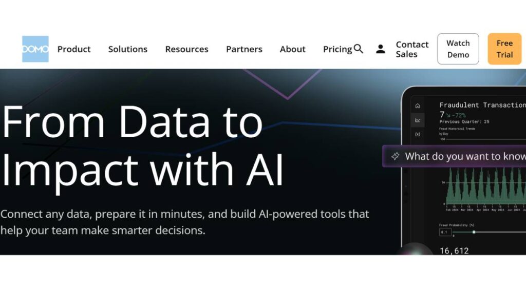
Domo goes all-in on centralization. Everything pulled into one place, one interface, one system to manage. On paper, that sounds ideal; and in some cases, it really is.
The benefit shows up in speed. Data connects quickly, dashboards update in real time, and collaboration is built in rather than added later. There’s less jumping between tools.
But centralization has a flip side. As usage grows, so does dependency. Costs can climb, and flexibility starts to matter more. Teams that like having tighter control over different parts of their stack sometimes feel boxed in.
4. Looker: Semantic Modeling + Governed Analytics
Looker feels different from the start. Less about quick dashboards, more about building a reliable data layer underneath everything.
That upfront modeling, defining metrics properly, and structuring data consistently, takes time. No way around it. But once it’s in place, things get smoother. Reports align, numbers match across teams, fewer debates over “which version is correct.”
It’s not the fastest tool to roll out. But for teams that have already felt the pain of inconsistent data, that trade-off usually makes sense.
5. Qlik Sense: Associative Analytics Engine
Qlik doesn’t follow the usual path. The associative model changes how data is explored; it’s less step-by-step, more open. You click around, follow connections, uncover things you weren’t necessarily looking for.
That can be powerful. Especially for teams doing exploratory analysis, where questions evolve as you go.
At the same time, it takes some getting used to. The interface isn’t always the most intuitive at first, and new users can feel slightly lost. Once it clicks, though, it clicks properly.
6. Zoho Analytics: Affordable Self-Service Visual Analytics
Zoho Analytics doesn’t try to compete at the high end. And that’s actually its strength.
It’s simple enough to get started quickly, without long onboarding cycles or heavy setup. Dashboards come together fast, reports are easy to share, and most business users can navigate them without much help.
There are limits, of course. Advanced analytics, large-scale data handling; those aren’t its strongest areas. But for smaller teams, or those just getting serious about analytics, it does more than enough.
7. Sisense: Scalable In-Chip Analytics + Embedded BI
Sisense shows up more often in product conversations than internal analytics ones. It’s built with embedding in mind, putting analytics directly into applications rather than keeping it separate.
Performance is a big focus. Large datasets, complex queries, real-time use cases; it handles those well. But it’s not a plug-and-play experience. There’s some technical lift involved, especially early on.
For product teams, that trade-off is usually fine. For non-technical teams, it can feel like a hurdle.
8. Yellowfin BI: Collaborative Analytics & Stories
Yellowfin leans into storytelling more than most tools. Not just charts and numbers, but context; what’s happening, why it matters, what to pay attention to.
That focus helps in environments where insights need to be communicated clearly, not just discovered. Stakeholders don’t always want to explore data themselves. Sometimes they just want the takeaway.
It’s a slightly narrower approach compared to bigger platforms, though. Less flexibility, smaller ecosystem. But for the right use case, it fits nicely.
9. SAS Visual Analytics: Advanced Analytics + Visual AI
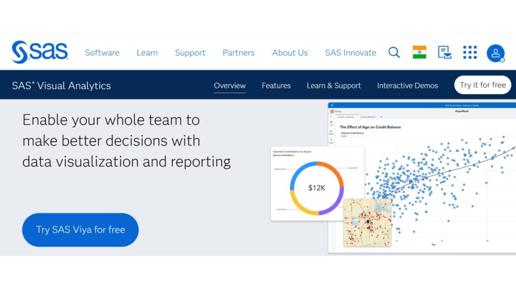
SAS sits firmly on the advanced end of the spectrum. Deep analytics, forecasting, and statistical modeling; it goes far beyond basic dashboards.
That depth comes with complexity. It’s not something teams casually adopt and figure out along the way. There’s usually a clear need driving the decision.
For large organizations dealing with heavy data workloads, it can be incredibly powerful. For smaller teams, it’s often more than necessary.
10. Explo: Embedded Visual Analytics for SaaS
Explo keeps things focused. It’s not trying to be a full BI platform. Instead, it does one thing well: embedding analytics into products quickly.
The SQL-first approach gives teams control without adding too much overhead. Dashboards can be built and integrated without long development cycles, which matters for fast-moving product teams.
It’s not meant to replace broader analytics tools. More of a layer that sits within a product experience.
11. Grafana: Real-Time Monitoring Dashboards
Grafana lives in a different category, really. More technical, more focused on time-series data and monitoring.
It’s widely used in engineering and DevOps environments, where real-time visibility isn’t optional; it’s critical. Dashboards update constantly, showing system health, performance metrics, and infrastructure data.
For business analytics, it’s not the right fit. But in its space, it does exactly what it’s supposed to.
12. KNIME: Open-Source Analytics & Workflow Visualization
KNIME approaches analytics through workflows instead of dashboards first. You build processes visually: data prep, transformation, modeling; then layer visualization on top.
It’s flexible, especially for teams that want control without being locked into a rigid system. Being open-source helps there.
The interface can feel dated, and it’s not as polished as commercial tools. But for technically inclined users, that’s rarely a dealbreaker.
13. Plotly: Developer-Driven Visual Analytics
Plotly isn’t really a plug-and-play platform. It’s more of a toolkit; something developers and data scientists use to build exactly what they need.
That flexibility is the main draw. Custom dashboards, interactive visuals, integration with Python or R; it all fits together well if the technical side is covered.
For business users, though, it’s not the easiest entry point. There’s no shortcut around the coding layer.
14. Databox: Agile Dashboards + Mobile Reporting
Databox keeps things lightweight. Quick dashboards, easy integrations, strong mobile experience. It’s built for speed, not depth.
Marketing and sales teams tend to like it because it surfaces key metrics without much setup. You connect tools, pull in data, and start tracking performance almost immediately.
But once analysis gets more complex, it starts to show limits. It’s not designed for heavy exploration.
15. Looker Studio: Free Interactive Dashboards
Looker Studio is often where teams begin. It’s free, easy to access, and connects well with the Google ecosystem.
For basic dashboards and reporting, it works. Sharing is simple, collaboration is straightforward, and setup doesn’t take long.
As data grows or use cases get more complex, though, performance can become inconsistent. It’s a good starting point, but not always the final destination.
A quick reality check
Tool selection tends to get overcomplicated.
Most issues don’t come from picking the “wrong” platform. They come from a mismatch. A tool that doesn’t align with how the team actually works, or what they actually need.
Too much complexity slows things down. Too little creates gaps.
Somewhere in the middle; that’s usually where things start to click.

Enroll Now: AI Marketing Course
How AI is Revolutionizing Visual Analytics Platforms
Something has clearly shifted over the last couple of years. Dashboards used to be static; build once, refresh, repeat. Now they’re starting to feel more… responsive. Less like reports, more like systems that actually help think through data.
A big part of that comes down to how AI is being layered into analytics; not as a flashy add-on, but as something that quietly changes how people interact with data.
Take natural language querying. Instead of building filters, dragging fields, tweaking charts… users just ask.
“What changed in the pipeline this week?”
“Why are conversions down in this segment?”
It sounds simple. And it is, on the surface. But what it really does is remove hesitation. People who wouldn’t normally explore data on their own start asking questions. That alone changes adoption.
Then there’s automated insight generation. This is where platforms start surfacing things you didn’t explicitly ask for: spikes, drops, unusual patterns. Not always groundbreaking insights, but enough to point attention in the right direction.
A few areas where this is showing up more clearly:
- AI-driven chart suggestions
Instead of choosing visuals manually, the system recommends what fits the data best. Not perfect, but it speeds things up. - Predictive analysis baked into dashboards
Forecasts, trends, expected outcomes; no need to switch tools or run separate models. - Anomaly detection
Subtle changes that would normally go unnoticed get flagged early. That’s often where the real value sits. - Automated dashboards
Reports that update, adjust, and even reframe themselves based on incoming data. Less maintenance, more relevance.
There’s still some noise in all this. Not every “AI insight” is useful. But when it works, it reduces the manual effort in a very real way. Fewer steps. Faster answers. Slightly better decisions.
That’s the direction things are moving in.
Common Use Cases for Visual Analytics Platforms
The use cases aren’t new, but the way teams approach them has changed. Less reporting for the sake of reporting… more focus on actually using the data in day-to-day decisions.
A few areas where visual analytics tends to deliver immediate value:
Marketing performance tracking
Marketing teams usually feel the impact first. There’s already a mix of channels, campaigns, metrics; without a clear view, things get messy fast.
Dashboards bring everything into one place:
- Campaign performance across channels
- Cost vs ROI breakdowns
- Funnel drop-offs
Not just visibility, but clarity. What’s working, what’s wasting budget, and where to adjust. And importantly, it’s visible to the whole team; not locked in spreadsheets.
Sales performance and forecasting
Sales data is always moving. Pipelines shift, deals stall, forecasts change week to week.
Visual analytics helps make sense of that movement:
- Pipeline health at a glance
- Conversion rates across stages
- Revenue projections based on current trends
It also surfaces patterns that aren’t obvious in raw data. For example, where deals consistently slow down, or which segments convert better over time.
Operational efficiency and cross-functional reporting
This is where things get a bit less visible, but arguably more important.
Operations teams use analytics to track:
- Process efficiency
- Resource allocation
- Bottlenecks across workflows
What usually stands out here is alignment. Different teams working from the same data, seeing the same metrics, without constant back-and-forth.
Financial analysis and executive reporting
Finance teams have always relied on data, but visual analytics changes how that data is consumed.
Instead of static reports:
- Real-time financial dashboards
- Scenario modeling
- High-level summaries for leadership
Executives don’t need to dig through details; they get a clear view of performance, trends, and risks. Quick reads, but grounded in actual data.
Across all these use cases, the pattern is similar. It’s not just about seeing numbers. It’s about reducing the gap between data and action. That’s where most of the value comes from.
Best Practices for Implementing a Visual Analytics Platform
Implementation is where things either click… or quietly fall apart.
It’s rarely about the tool itself. More about how it’s introduced, how teams adopt it, and whether it actually fits into existing workflows.
A few things that tend to make a noticeable difference:
Start with business outcomes, not dashboards
It’s easy to jump straight into building dashboards. Feels productive. But without clear goals, those dashboards drift.
Better to start with questions:
- What decisions need to be made faster?
- Where is visibility currently lacking?
- Which metrics actually matter?
Once that’s clear, the dashboards make more sense. They serve a purpose instead of just existing.
Set up governance early (even if it feels slow)
This part usually gets delayed. Understandably, teams want to move fast.
But without some structure:
- Metrics get defined differently
- Reports start conflicting
- Trust drops
Even lightweight governance helps. Agreed definitions, basic access controls, and some consistency in how data is used. It doesn’t need to be perfect, just present.
Focus on quick wins first
Rolling out everything at once rarely works. Too much change, too many moving parts.
Instead:
- Pick one or two high-impact use cases
- Build dashboards that solve real problems
- Get those in front of teams quickly
Once people see value, adoption becomes easier. Momentum builds from there.
Make it part of daily workflows
A dashboard that’s opened once a week doesn’t change much.
The real shift happens when analytics becomes part of routine decisions:
- Daily standups
- Weekly reviews
- Campaign check-ins
It should feel natural to reference data, not like an extra step.
Invest in adoption, not just setup
Even the best platform won’t get used if teams aren’t comfortable with it.
That doesn’t mean heavy training programs. Often, it’s simpler:
- Clear documentation
- A few guided use cases
- Ongoing support when questions come up
Small things, but they add up.
Implementation isn’t about getting everything right upfront. It’s more iterative than that. Adjusting as teams use the platform, refining what works, dropping what doesn’t.
The goal isn’t perfection. It’s consistent use and decisions that are just a bit more informed than before.
Troubleshooting & Adoption Challenges
This is the part most teams underestimate. The platform gets selected, dashboards start taking shape… and then adoption slows down. Not dramatically. Just enough to notice.
Usually, it’s not a technical failure. It’s small, compounding issues that make people quietly disengage.
Data quality and consistency
If the numbers don’t match, nothing else matters.
It doesn’t take much; slightly different definitions, delayed updates, missing fields, and suddenly, people start questioning the data instead of using it.
A few common patterns show up:
- Marketing sees one revenue number, finance sees another
- Dashboards don’t align with exported reports
- Metrics change depending on filters; no one fully understands
Once trust slips, it’s hard to recover. Teams go back to spreadsheets, side calculations, and manual checks.
Fixing this isn’t glamorous. It’s about consistency:
- Clear metric definitions
- Reliable data pipelines
- Fewer “versions of truth” floating around
Not exciting, but necessary.
Training for business users
There’s an assumption that modern tools are “intuitive enough” to skip training. Sometimes that’s true… up to a point.
But real usage goes beyond clicking around. People need to understand:
- What they’re looking at
- How to interpret trends
- When to trust (or question) what they see
Without that, dashboards become passive. Opened occasionally, not relied on.
Training doesn’t have to be heavy. In fact, lighter tends to work better:
- Short walkthroughs tied to real use cases
- Simple explanations of key metrics
- Ongoing support when questions come up
It’s less about teaching the tool, more about building confidence in using data.
Balancing governance with flexibility
This one’s tricky. Too much control, and everything slows down. Too little, and things get messy fast.
On one side:
- Strict permissions
- Centralized dashboard creation
- Heavy approval processes
On the other:
- Anyone building anything
- Metrics are defined differently across teams
- Dashboards multiplying without structure
Neither works well long-term.
The balance usually sits somewhere in the middle:
- Core datasets and metrics are governed
- Exploration is flexible
- Teams can build, but within a shared framework
It’s not perfect. It never is. But it keeps things usable without losing control.
Future Trends in Visual Analytics
A lot of changes in this space feel gradual… until they don’t. Then suddenly, the way teams interact with data looks completely different.
A few trends are already taking shape. Not fully there yet, but clearly moving in that direction.
Conversational analytics and AI-first BI
The shift toward asking questions instead of building dashboards is picking up pace.
Instead of navigating layers of filters and charts, users just type what they want to know. The system interprets it, pulls the data, and presents an answer.
It sounds simple, but it changes behavior:
- More people engage with data
- Questions happen faster, more frequently
- Exploration becomes less structured, more natural
There’s still some friction; interpretation isn’t always perfect, but the direction is clear.
Augmented analytics workflows
Analytics is becoming less manual.
Not fully automated, but assisted in ways that reduce repetitive work:
- Suggested insights instead of blank dashboards
- Recommended visualizations based on data patterns
- Automated explanations layered onto charts
The role of the user shifts slightly. Less time building, more time evaluating and acting.
That’s the idea, at least. Execution varies.
Embedded AI visuals in day-to-day tools
Analytics is slowly disappearing into the tools people already use.
Instead of switching to a separate dashboard:
- Insights show up inside CRM systems
- Performance data appears in marketing platforms
- Operational metrics are visible within internal tools
It’s a subtle change, but important.
When data is part of the workflow, it gets used more. When it requires switching context, it often doesn’t.
None of these trends is about adding complexity. If anything, they’re moving in the opposite direction, making analytics feel less like a specialized task and more like a natural part of work.
Conclusion:
At some point, every team hits the same problem. There’s plenty of data… but not enough clarity.
Reports exist. Dashboards exist. But decisions still rely on partial information, delayed insights, or gut instinct filling in the gaps.
That’s where visual analytics platforms start to matter; not as reporting tools, but as decision systems.
They help in a few very real ways:
- Synthesizing insights faster across teams
Instead of pulling data from multiple sources and trying to reconcile it, everything comes together in one place. Patterns become visible earlier. Conversations become more focused. - Reducing friction in decision-making
Less time spent finding data, more time actually using it. That shift is subtle, but it compounds over time. - Making data accessible beyond analysts
When non-technical teams can explore and understand data on their own, things move faster. Fewer bottlenecks. More ownership. - Creating alignment around metrics
Shared dashboards, consistent definitions; everyone working from the same view. That alone prevents a lot of confusion.
At the same time, the platform itself isn’t the outcome. It’s just the layer that connects data to action.
What matters is how it’s used. Whether teams trust it, rely on it, and build it into their everyday decisions.
Because in the end, growth doesn’t come from having more data. It comes from understanding it; quickly, clearly, and consistently enough to act on it.
FAQ: Visual Analytics Platform
What is the best visual analytics platform for SMEs?
“Best” sounds nice, but it’s usually the wrong question. For smaller teams, the better pick is the one that doesn’t slow things down after week one. Something that’s quick to set up, easy to revisit, and doesn’t start breaking once real data shows up. Pricing matters too, especially when it quietly scales. A lot of teams realize this a bit late. The tools that stick are the ones people don’t have to think about too much.
Can visual analytics help non-technical users?
Yes… But only when the setup respects how people actually work. A dashboard can look clean and still be confusing. Happens more than expected. If someone can’t answer a basic question in a few clicks, they stop trying. Good setups remove that hesitation; clear labels, sensible filters, no guessing. Not perfect, but usable. That’s usually enough.
How does AI assist in visual analytics?
Mostly in small ways. Suggesting a chart, surfacing a spike, pointing at something slightly off. It saves time more than anything. The tricky part: context. AI doesn’t always have it. So it might highlight something technically correct but not actually important. Helpful, yes. But it still needs a second look before acting on it.
What are the cost tiers for top platforms?
The starting price is rarely the full story. Entry plans look reasonable, and for a while, they are. Then usage grows; more users, more data, more moving parts; and costs follow. Not dramatically, just steadily. And there’s always the hidden side: onboarding time, training, occasional fixes when something doesn’t sync right. Those don’t show up in pricing tables, but they’re part of the reality.
Which platform has the easiest dashboard builder?
“Easy” depends on how a team thinks. Some prefer drag-and-drop and quick wins. Others want more control, even if it takes longer. The tools that feel easiest usually get one thing right; they don’t overload the first experience. You connect data, build something simple, and it works. No friction. That first impression matters more than most feature lists.
How do visual analytics platforms improve business decision-making?
They shorten the gap between question and answer. That’s really it. Instead of waiting on reports or digging through spreadsheets, teams can just check and move forward. Over time, decisions feel less reactive. Still not perfect; nothing is, but there’s less guessing involved. And fewer delays, which tends to matter more than expected.
What are the most important features to look for in a visual analytics platform?
Not the flashy ones. Stability comes first. Dashboards that load when they should, data that doesn’t randomly break, performance that holds up under pressure. Everything else builds on that. Governance, scaling, permissions; they matter, just a bit later. Tools that try to do everything up front often slow teams down. The balanced ones tend to last longer.
Can visual analytics platforms integrate with existing CRM or ERP systems?
Usually, yes. Most platforms have connectors or APIs ready to go. The real challenge shows up later: keeping those connections clean. If the underlying data is messy or constantly changing, things get fragile. When integration works well, it fades into the background. When it doesn’t… It’s hard to ignore.
How secure are visual analytics platforms for sensitive business data?
On paper, security is solid. Permissions, encryption, compliance layers; all there. The weak spot is often internal. Access gets shared too broadly, roles aren’t clearly defined, and data ends up in more places than intended. The platform can enforce rules, but only if someone actually sets them up properly. That part gets overlooked sometimes.
What is the difference between self-service visual analytics and enterprise BI?
It comes down to control versus flexibility. Self-service lets teams explore, move quickly, and test ideas without waiting. Enterprise BI is more structured; defined metrics, tighter guardrails. Both solve different problems. Too much freedom gets messy. Too much structure slows everything down. Most teams end up somewhere in between, even if they didn’t plan it that way.
How do AI-powered dashboards differ from traditional dashboards?
Traditional dashboards show what’s already been decided: fixed metrics, set layouts. AI-driven ones try to guide attention a bit. Highlighting patterns, flagging anomalies, nudging toward something worth a look. It’s useful, especially when data gets large. But it’s still guidance. Someone still needs to interpret what’s actually going on.
Are cloud-based visual analytics platforms better than on-premise solutions?
For most teams, the cloud just feels easier. Faster setup, fewer technical hurdles, easier to scale when things grow. That said, some environments still lean on-premise, usually for control or compliance reasons. It’s less about one being better overall, more about what fits the situation.
Which visual analytics platform is best for real-time data monitoring?
The ones built for constant updates tend to hold up better. Real-time isn’t just about speed; it’s about consistency. Data should refresh without glitches, and dashboards shouldn’t lag when activity spikes. If that reliability isn’t there, trust drops quickly. And once that happens, even accurate data doesn’t carry much weight.
Can visual analytics platforms handle big data and multiple data sources?
They can, but it’s not automatic. Large datasets need structure; performance starts slipping. Multiple sources add another layer; things need to align properly, or confusion creeps in. The platform plays a role, but setup matters just as much. When both are handled well, things feel smooth. When they’re not, issues show up fast.
How long does it take to implement a visual analytics platform?
Longer than expected, more often than not. A simple setup can be done fairly quickly, especially with clean data. But once multiple teams and systems get involved, timelines stretch. Not because the tool is slow, but because alignment takes time. Agreeing on definitions, metrics, ownership… that part tends to drag.
Do visual analytics platforms support mobile and remote access?
Yes, that’s mostly standard now. Dashboards are accessible from browsers or mobile apps without much effort. The real question is usability. Some dashboards don’t translate well to smaller screens. When they do;clear, readable, simple, people actually use them. Otherwise, they don’t bother much.
How do predictive analytics features work in visual analytics platforms?
They use historical data to project what might happen next. Patterns get extended forward, basically. Useful for spotting trends early. But not something to treat as certain. Real-world changes don’t always follow past behavior. So it’s a guide, not a guarantee. That distinction matters more than it seems at first.
Can visual analytics platforms generate automated reports and alerts?
Yes, and this is where things get practical. Reports can run automatically, and alerts can trigger when something changes. Saves time. But there’s a balance; too many alerts and people start ignoring them. Happens quickly. Fewer, more relevant triggers tend to work better in the long run.
What industries benefit most from using visual analytics platforms?
Any team working with ongoing data, really. Marketing, finance, operations; obvious fits. But even teams that don’t think of themselves as data-heavy start seeing value once reporting becomes consistent. It’s less about industry, more about how often decisions depend on timely information.
Are open-source visual analytics platforms reliable for enterprise use?
They can be, but they come with trade-offs. More control, lower upfront cost… but also more responsibility. Setup, customization, maintenance; it all sits internally. For teams with strong technical support, that’s manageable. For others, it turns into an ongoing effort. The trade-off shows up over time.
How do visual analytics platforms handle data visualization for executives vs analysts?
Same data, different expectations. Executives usually want clarity: key numbers, quick summaries, minimal noise. Analysts want depth; filters, drill-downs, room to explore. Good platforms support both without forcing a single view. When that balance isn’t there, one side ends up frustrated. Either things feel too shallow… or unnecessarily complex.